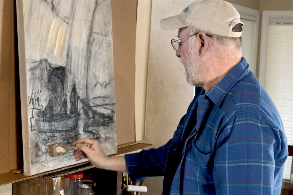
Welcome back for another free art lesson from our studio in Hillsboro. In the last tutorial, one of the artists at Golden Road Arts, Erik Sandgren, created the outline for his painting “Fish Fishermen Rain Rainbow.”
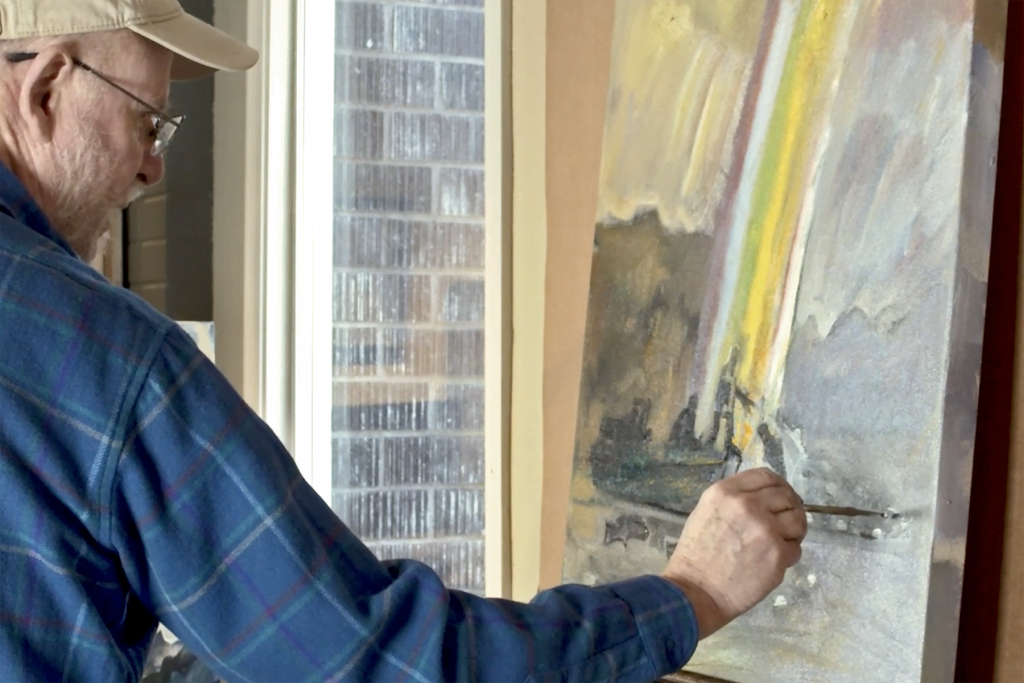
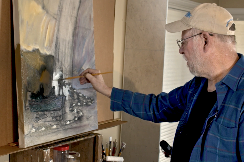
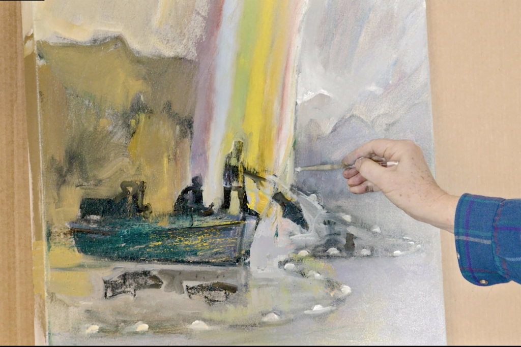
In part two of the series, Erik develops the painting further by adding color and texture to the canvas.
Adding Color and Complexity to a Painting Video
Learn how Erik Sandgren develops a painting using the re-ambiguation process. Using techniques like scraping, glazing, redrawing and reshaping, Erik opens up the picture and brings out new ideas.
Materials Required for Developing a Landscape Painting
- Acrylic paint
- Paintbrush
- Painting knife
Watch part one in the series to see how the outline for the painting began – Charcoal Painting With Erik Sandgren.
Watch the Developmental Stage of a Painting
Read along with the video transcript to find out how to build on the initial concept and introduce complexity to a painting. If you would like to own art by some incredible Oregon artists, you can buy art online from our gallery.
So now, I take out one of my bigger brushes, and I’m kind of interested now in making this. It always amazes me how just the addition of a little bit of color begins to change that and I think I want it over on this side. If I’m going to go with a yellow basic kind of light, I think in the light areas, I think I’m going to go slightly violet on the inside of the rainbow and with all these distant mountains and with this water and all the way down here. And so, the joy of painting is to be able to toss that stuff in there, toss that stuff up there without worrying about it too much, just trying to get a basic feel for how it might feel to play this light yellow against the darker violet over on the other side.
So, what can this be? I’ve thought of this dark in terms of dark, but I haven’t thought of it in terms of color. But since it has an affinity with the sky over here, I’m going to keep it in the yellow blue, darker yellow. That’s a concept you could find hard to wrap your mind around, isn’t it? Dark yellow in that? Interesting. So I guess you might say it’s why I like umber because umber is fundamentally a dark yellow. All those mustard colors and it’s the colors of Oregon winter and Oregon early spring.
So the way this is, so your question or your observation, David, earlier about composition is so interesting to me, because here’s where the color choices that a painter has available are all about enhancing that compositional idea, not just about not merely describing what these objects are. And I’m painting around the edges here because this happens to be a wraparound canvas. Maybe one day it won’t need a frame, and so just in case I’m carrying the paint all the way around, at least to get it started.
So, another part of my, sort of, founding idea for this image was these floats. There’s almost a decorative line of floats, so there might be one here and there’s one here and there’s one here. And in real life they are evenly spaced around the net, around the top of the net, holding it and fixing it in the proper position in the water. And so, they probably get farther apart as it comes forward.
So, I just love painting wet into wet like this. I think that’s the joy of many oil painters also, and in acrylic, you can have it if you coat the whole thing first. And otherwise, if you paint just part by part, it’ll dry. So that to me presents this – it’s not well crafted yet in terms of drawing – but I think the spacing and the scale and my objective in a painting is to throw everything up there, get it all up there first and adjust it later. And so rather than paint one part, one part one by one, and linger on it, to the exclusion of other parts, I’m trying to in effect, if I could, paint it all at once I would. Since that’s a physical impossibility, the closest I can approximate that is through some kind of urgency and efficiency, and in dispatch and getting everything there.
And I know that in my drawing my boat was dark. I haven’t given it any thought and I’m seeing already that I’m not quite sure I’m happy with bringing all that violet into the boat, so maybe the boat at this end really needs to be something more akin to the landforms that it’s massing with. And so, I’m going to wet into wet. I’m going to scribble some of that color in there and see how that, see how that looks.
I’d envisioned the engine as a black like an Evinrude or a Toyatsu or something like that. Or maybe a Mercury. The figures are a little smaller than I had them. And I love this idea of this figure as silhouetted against the rainbow. In reality, most of these gillnetters wear yellow Mackintosh getups, you know. Should I have this? You know, might be interesting. I didn’t have it in my drawing to have a hand out here. The hand that would be grabbing that net. And we’ll leave that other hand invisible but maybe one hand. And I want to get that fish in here pretty early too. Because that’s one of the hallmarks to the image, I think, is to get that, is to silhouette that fish and maybe have another one indicated right there. So, well, we’re getting there.
So, now it’s time, I think, to get in there a little bit and define some of these things a little bit more carefully. How big should this person be? I don’t know. How big should this person be? I don’t know. I know this one standing up on the head of the boat, there’s the hand that I’d sort of thought about. And anything’s a starting point for the painting. I’m not worried about getting the figures right or proportional as figures. At this stage, I’m interested in throwing them up there. This one looks like it has the proportions of a child at the moment and I’m not sure that’s appropriate to what I’m doing, but that’s easily changed and I want to carry this silhouetting aspect down into here. And we’ll make this into the fish right there. Carry that around.
Well, the beautiful thing about painting is it so absorbing to me that I’m barely conscious of being filmed here. It’s just the painting, just like, absorbs everything. I broke out a new brush for this occasion and it’s got nice sharp edges. My materials are pretty traditional I would say. One of the reasons they are traditional is – I produce paintings that I hope will live a long time, so to speak. It’ll be around awhile in people’s homes and galleries and places of business and occasionally, with some luck, a museum. And so, I want those materials to be durable. And I want them to be archival and that’s part of the reason traditional materials are traditional materials is because they’re enduring. So, I stretch my own canvases and use proper stretcher bars and ground things and seal.
So, I like the business of carrying this landform here in back of the rainbow, as if it’s a little bit transparent you know. And I could probably seek to pull that out on the other side a little bit too. And so that I can see that’s one of the things that will keep me occupied with this painting for some time to come is balancing, you know, balancing all those different considerations of translucency and opacity.
So, one thing I always have to think about, it’s just that there’s certain basic things in life as a figurative painter I want to get right, you know. I mean, so many elements of my paintings are abstract in that proper sense of taking from nature and exaggerating or making it somehow essential. So, despite how many things are abstract, when it comes to a rainbow, we all know it’s ROYGBIV, right? So which color’s on the inside? Isaac Newton insisted that there’s an indigo in there, and frankly, I’ve never seen it. But he wanted the colors – the number of colors – to rhyme with his idea of celestial organization of planets and all that. So, there’s got to be an indigo. He wanted the number 7, so even Newton was subject to number mysticism a little bit. So that got a little red, but at least we’ll call that a violet and blue, ROYGBIV, indigo. And, we’ll make this blue, red.
And so, the solvent for acrylic paint is just water, which is very nice. It’s convenient, but it’s also consistent with my interest in being a watercolor painter. I love aqueous media. We want orange next after red. That’s a little on the yellow side, but as long as I make it lighter and get the big arc in here. Orange and yellow. So that yellow is going to correspond right with that figure. So, I’ll have the very darkest thing with the very lightest color both together at one spot down at the bottom of the painting, which is kind of visually exciting to me.
And then I’m going to need some kind of a green between. And of course, being radiant light, all this has to be lighter than the landscape. So we’ll put the green between the yellow and the blue. And how far up do I need to carry that? You know, I really don’t know. Wow, that’s kind of startling. Do I want any of these colors down all the way into the bottom? Maybe, you know. Maybe the way the rainbow could pass through this passage that I’m talking about and come out all the way down at the bottom, like that. That’s an idea. And then – at a certain point – which seems, I feel like it’s coming up soon. This is that cloud that I was talking about in the drawing here. Back to umber, back to one of those warm yellows.
It took me years to realize, speaking of warm and cool, all my winter paintings of the northwest were so blue violet, so cold. And it took me years to realize that fog is warm, not only as an atmospheric phenomenon, but, in terms of color, fog is umber. Fog is umber with white. And I may want that cloud to come out a little bit over on this side and that kind of unifies those things up there a little bit. At a certain point which is coming up really soon here – I’m going to go around the side here so I don’t have to fight that color later. I like to have just some kind of bed of something there in front right from the beginning so that there’s a consistent texture and feel to the paint. I think this could be darker.
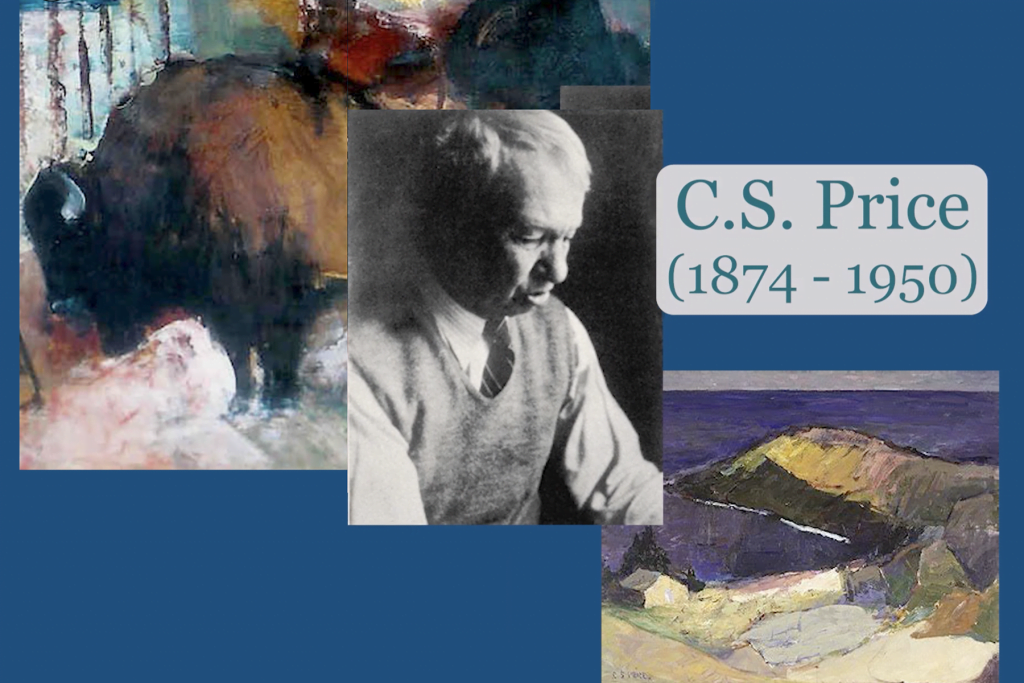
One of the things the great northwest painter C.S. Price used to say – one cymbal clash per painting. One cymbal clash, not too many rivals. So, another way of looking at that is a painting is a little bit of a zero sum game. If I want this to be the focal point, I have to tone everything else down a little bit. At least a little bit. It’s kind of like hierarchies of value or something like that. Yeah, that’s enough on the side.
So, I keep working myself up to this, but at some point this is ready for what I like to call re-ambiguating. But I’m going to take everything that I’ve got there and make it a little less pretty and a little less obvious and scatter that color around. And, at first, it seems very destructive, but in the long run what I’m doing is making all the hard lines of my initial intention go away, just deliberately contradicting them and say those things – even though I liked some of it. And, wow, the secret of doing that is to be very generous about it. Don’t be picky and try to save stuff, you know. And for me, the way a painting acquires power and depth and richness, layers physically, and even psychological truth, is by constantly going through the stages of re-ambiguating and finding the image again in the mess that one has just created and pulling it out, so to speak, of a tangle of possibilities again and again and again.
It just occurs to me that never occurred to me before – I can show a hand here. And I can show that hand that I put in there was just a note that disappeared. Let me put that there again and of course it’s really important to get that fish back. So, I guess more than I could ever possibly demonstrate in a single session of painting, I think of my paintings as structures like this that come and go. That we put something down and then it disappears and then it comes back again. In those physical disappearances, it begins to pick up depth and possibility and power and richness and all kinds of things that wouldn’t happen if it were just a matter of intention. So, I guess you could look at it as kind of deliberately giving accident a role, an opportunity, a chance. Something bigger than the artist to contribute to the image, you know.
And so I’m going to try to get those floats back in there and that scraping kind of taught me that they don’t need to be all that clear. And so maybe they will be unknown to people who’ve never seen gillnetters. Maybe those will be kind of mysterious features, and maybe they’ll be more like steps to the rainbow or something, you know, something completely magical. And then you’re back at where life is all about to begin with anyway. You know, the awe and mystery of it.
Interesting. I think this is a little harsh right in here. I wonder if I can, you know, darken that up consistent with – yeah, there we go. I wonder what happens if we bring a little light in there. Now, my previous mountain range was way down there. I’ll try it up here. Another way I constantly re- ambiguate things is by moving the outlines of things. So, I intended this to be down here. But this time I painted, I’ll move it up here. I don’t know – by the time I finish the painting, I don’t know where it will be. Might be, could be, might be very useful to have some of the division, you know, all the way down here too, you know.
So, at this early stage, I try to avoid putting things in, you know, deer on the hillside and no stumps and trees and all kinds of detail, because I want to be able to be free to move that around quite a bit before it assumes its final position. And in the course of moving around, maybe it’ll pick up some meaning. It did occur to me though, so I was saying that it might not hurt to have some little trees here. Maybe I could make this a clear cut as the kind we see so much in Oregon and that I saw so much. And those are almost like the barbs of a hook or something like that back here.
So, I’ve just added an element that wasn’t in my sketch at all, and if I don’t like that, you know I could, or if I’m not sure maybe the color is good but those shapes aren’t well drawn, maybe just knock it back down there and that’s a reminder of something I could do later. I think I like it better. In that zero sum game way of value contrast, if I put too much detail into these other areas, that takes away from the drama of this. This is the heart of the painting right there, and I’m going – as I paint on it and develop it – I’m going to try to keep it that way.
Access Free Art Lessons for Kids
Golden Road Arts produces free art instructional lessons and in-person live events for elementary and middle school kids. Start watching our free art lessons here.
To support the development of future videos, please consider donating to Golden Road Arts.
